Your HubSpot site needs a product comparison table. Maybe you sell three plans and visitors cannot figure out which one includes what. Maybe you are comparing your product against competitors and want a clean, structured layout that does the selling for you. Either way, the default HubSpot modules do not have anything built for this. You end up with a rich text table that breaks on mobile, or a custom coded section that nobody on your marketing team can update.
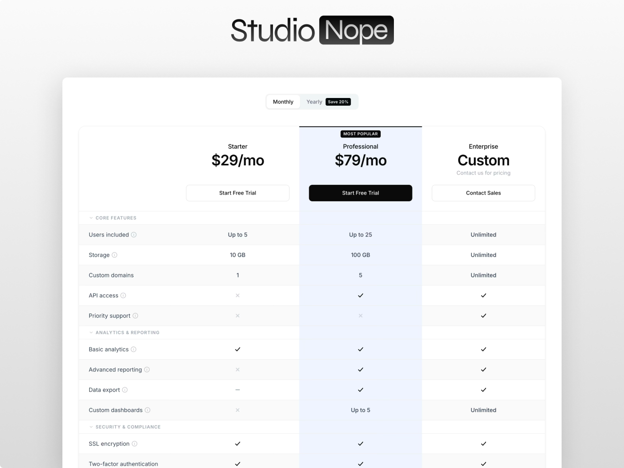
Comparison Matrix Pro is a standalone HubSpot comparison table module that handles everything: side by side product grids, categorized feature rows, collapsible categories, billing toggles, featured column highlights, tooltips, and CTA buttons. Drop it on any page, configure it from the visual editor, and publish. No developer needed. No theme dependency. No jQuery.
Why Comparison Tables Convert Better Than Feature Lists
When visitors land on a pricing or product page, they are making a decision. They need to see differences between options at a glance. A bulleted feature list forces them to read everything, remember what Plan A includes, scroll back up to check Plan B, and mentally compare. That is friction, and friction kills conversions.
A structured comparison table removes that friction entirely. Products sit in columns. Features sit in rows. Check marks, crosses, and text values make differences immediately visible. A 2025 design study found that pricing pages with clear visual hierarchy and whitespace convert 28% better because they reduce cognitive overload. The comparison table format is the standard for SaaS pricing pages because it works.
Companies like HubSpot, Slack, Notion, and every serious SaaS business use comparison tables on their pricing pages. The reason is simple: when people can scan and compare without effort, they make decisions faster and with more confidence.
The Problem with Comparison Tables on HubSpot CMS
HubSpot does not ship a native comparison table module. Your options have been:
- Rich text tables. You paste an HTML table into a rich text module. It looks fine on desktop, breaks completely on mobile, and becomes a nightmare to edit. Adding a column means editing raw HTML. No content editor wants to touch it.
- Custom coded sections. A developer builds a comparison table as a coded template section or custom module. It works, but it is locked to one page. Every change requires a developer. If you need a different comparison on another page, you need another custom build.
- Free marketplace modules. A handful exist, but they top out at basic two or three column grids with limited styling. No collapsible categories. No billing toggle. No tooltips. No featured column highlights. You install one, realize it cannot do what you need, and you are back to square one.
Comparison Matrix Pro was built because every other option on the HubSpot Marketplace falls short of what a real SaaS pricing page or product comparison page requires.
What Comparison Matrix Pro Actually Does
Side by side product grid
Display 2 to 6 products as columns in a CSS Grid layout. Each product gets its own header with name, optional SVG icon, dual pricing (for billing toggle), a price note, and a CTA button. The grid is not built with HTML tables. It uses CSS Grid, which means full responsive control without the layout headaches that come with traditional table markup.
Categorized feature rows with five value types
Organize features into up to 10 categories, each with up to 30 features. Every feature supports five value types per product: check (green checkmark), cross (red x), partial (yellow circle), text (custom string like "10 GB" or "Unlimited"), or empty. This covers every comparison scenario from simple yes/no feature checks to nuanced plan differences.
Collapsible categories
Category rows act as accordion headers. Click to collapse or expand all features within that category. This is critical for comparison tables with a lot of features. Visitors can focus on the categories that matter to them without scrolling through 50 rows of features they do not care about. Categories can be set to start collapsed, and the collapse animation is configurable.
Billing toggle with discount badge
An animated switch between two pricing sets. Label it Monthly/Annual, or use any custom labels. Each product has two price fields, one for each toggle state. An optional discount badge ("Save 20%") surfaces the savings incentive right at the decision point. The toggle uses ARIA attributes for accessibility.
Featured column highlight
Mark any product as featured and the entire column gets a distinct background highlight that extends through every row: header, category rows, feature rows, and CTA row. An optional top border accent and a positioned badge ("Most Popular" or any custom text) draw the eye to your recommended plan. This is the visual nudge that guides visitors toward the option you want them to choose.
Tooltips on every feature
Optional info tooltip on any feature row. Hover or focus to see additional context. Keyboard accessible with tabindex and aria-label. Useful for explaining what a feature actually means without cluttering the table with long descriptions.
Mobile That Actually Works
Mobile accounts for 58% of SaaS pricing page traffic in 2026. A comparison table that breaks on mobile is not just an inconvenience. It is lost revenue.
Comparison Matrix Pro uses a split header and body architecture. On mobile, the body scrolls horizontally while product headers stay visible at the top. The first column (feature names) can be set to sticky so visitors always see what they are comparing as they scroll through products. Font sizes scale down at configurable tablet and mobile breakpoints.
This is not a "stack everything vertically and hope for the best" approach. The table stays a table on mobile, but one that actually works with touch and small screens.
80+ Style Controls, Zero Hardcoded CSS
Every visual element is configurable from the Style tab in the HubSpot editor. The controls are organized into 13 groups:
- Fonts: Separate Primary font (title, product names, prices) and Secondary font (feature names, values, buttons, labels). Full Google Fonts picker with auto loading. Or check one box to inherit fonts from your page or theme.
- Section: Background color and padding.
- Table: Background, border color, border width, border radius, shadow, cell padding, stripe color for alternating rows, hover highlight color.
- Product headers: Name and price colors, sizes, and weights. Price note color and size.
- Featured column: Background, header background, border color, border width.
- Badges: Background, text color, font size, border radius.
- Category headers: Background, text color, font size, font weight.
- Feature rows: Name and value colors and sizes. Check, cross, and partial icon colors. Icon size. Tooltip background and text colors.
- Buttons: Primary, secondary, and ghost styles. Each with background, text, hover, border controls, font size, weight, padding, border radius, and full width toggle.
- Toggle: Background, text, active background and text, slider color, discount badge colors, border radius.
- Responsive: Font scaling at tablet and mobile breakpoints.
Nothing is hardcoded. If your brand uses a specific shade of green for checkmarks or a particular border radius on buttons, you set it once and it applies everywhere.
Eight Behavior Toggles
Beyond styling, eight settings toggles control how the table behaves:
- Layout mode: Compact or comfortable cell padding.
- Sticky header: Product headers stay visible as visitors scroll down long feature lists.
- Sticky first column: Feature names stay visible during horizontal scroll on mobile.
- Striped rows: Alternating row backgrounds for better readability.
- Show CTA row: Toggle the bottom row with action buttons on or off.
- Hover highlight: Highlight the entire row on hover so visitors can track across columns.
- Animate collapse: Smooth max height and opacity animation on category expand and collapse.
- Scroll animation: IntersectionObserver based entrance animation. The heading, toggle, and table rows fade up on scroll with staggered timing. Respects prefers-reduced-motion.
What You Can Build With It
Comparison Matrix Pro is not limited to pricing tables. Here is what teams are using it for:
- SaaS plan comparison pages with monthly and annual billing toggle, feature categories, and a highlighted recommended plan.
- Product feature matrices that compare hardware specs, software capabilities, or service tiers with text values and tooltips.
- Competitor comparison pages where your product sits next to competitors with honest feature checks. These pages rank well for "[your product] vs [competitor]" searches.
- Service tier comparisons for agencies, consultancies, or professional services firms that offer multiple engagement levels.
- Internal tool evaluations on intranet pages where teams compare vendor options.
Works on Any HubSpot Portal
Comparison Matrix Pro is a standalone module. It does not require a specific theme. Install it in any HubSpot CMS portal, drop it on any page template, and configure everything from the visual editor. Multiple instances on the same page are fully isolated through scoped CSS, so you can run two different comparison tables on one page without style conflicts.
No jQuery. No external dependencies. Pure vanilla JavaScript. Fast load times and clean Core Web Vitals scores because the module does not pull in libraries your visitors do not need.
Get Comparison Matrix Pro
Comparison Matrix Pro is available on the HubSpot Marketplace for $9.99. See the live demo and full documentation on the product page. Browse all Studio Nope modules.
If your HubSpot pricing page or product comparison page is still a rich text table that breaks on mobile or a static layout that nobody can edit, Comparison Matrix Pro is the module that fixes it.